Mütter Museum Rebrand
2019, Art Direction by JASON KERNEVICH
The Mütter Museum is a medical museum located in the Center City Philadelphia, Pennsylvania. The museum currently houses over 20,000 specimens of medical abnormalities, pathological specimens, wax models, and antique medical equipment in a 19th-century “cabinet museum” setting. The museum helps the public understand the mysteries and beauty of the human body and to appreciate the history of diagnosis and treatment of disease. Today, the Museum enjoys a steadily rising reputation with annual attendance exceeding 130,000 visitors. The current branding feels dated and in need of a new graphic identity. I created a fresh identity, advertisements, and website for my rebrand of the Museum.

The current branding of the museum feels dated but not in a delightfully antiquated way you might expect with such a museum. The old logo utilizes the classic Harry Potter font as well as having some obvious special issues. The current logo and branding overall has more of a whimsical look and feel and I wanted to create something darker and more intentional to better represent the macabre nature of the museum.

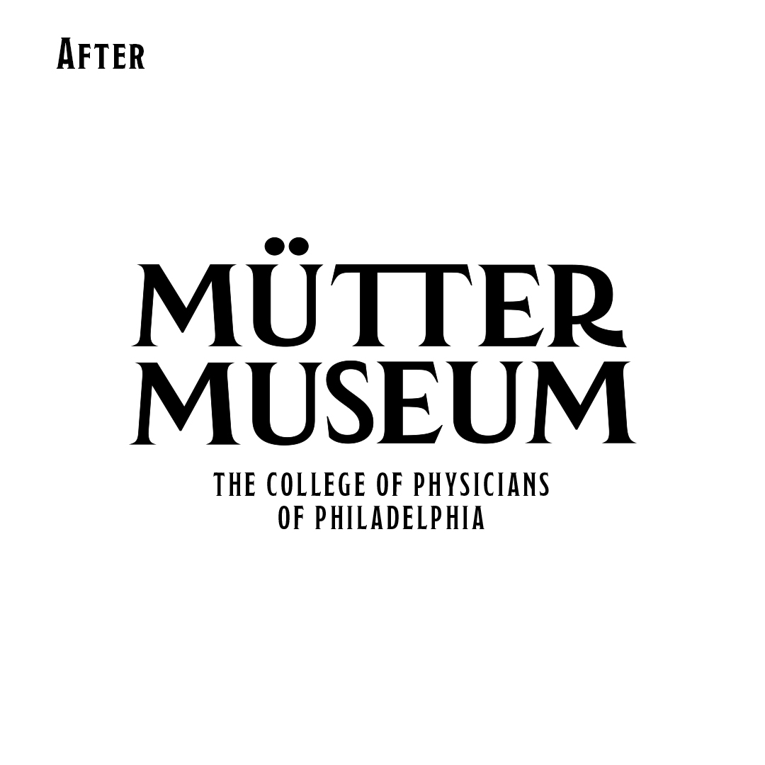
When I began the rebrand I started with the logo. I knew I wanted to maintain the typographic logo design because the museum’s name is unique and filled with personality, so I decided to embrace that with a wordmark. My process consisted of browsing through hundreds of typefaces to find one that captures the Mutter’s macabre yet elegant vibe. The challenge was finding the perfect typeface that was strange and unique yet still sophisticated since it is a logo for an esteemed museum.
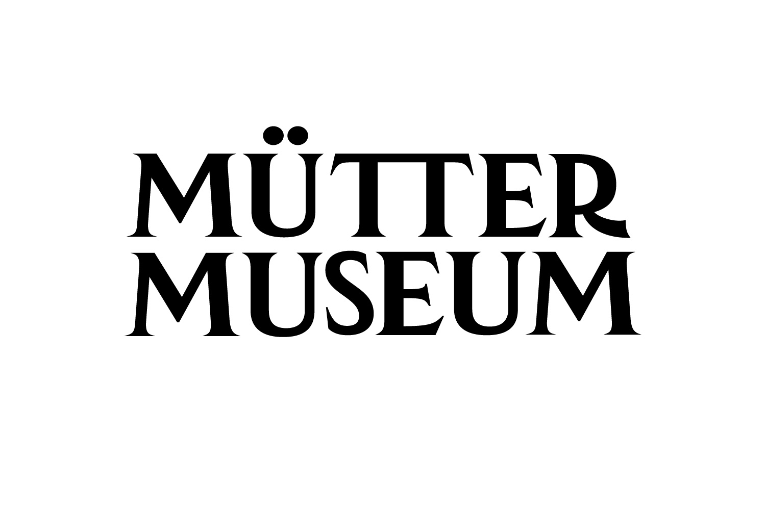
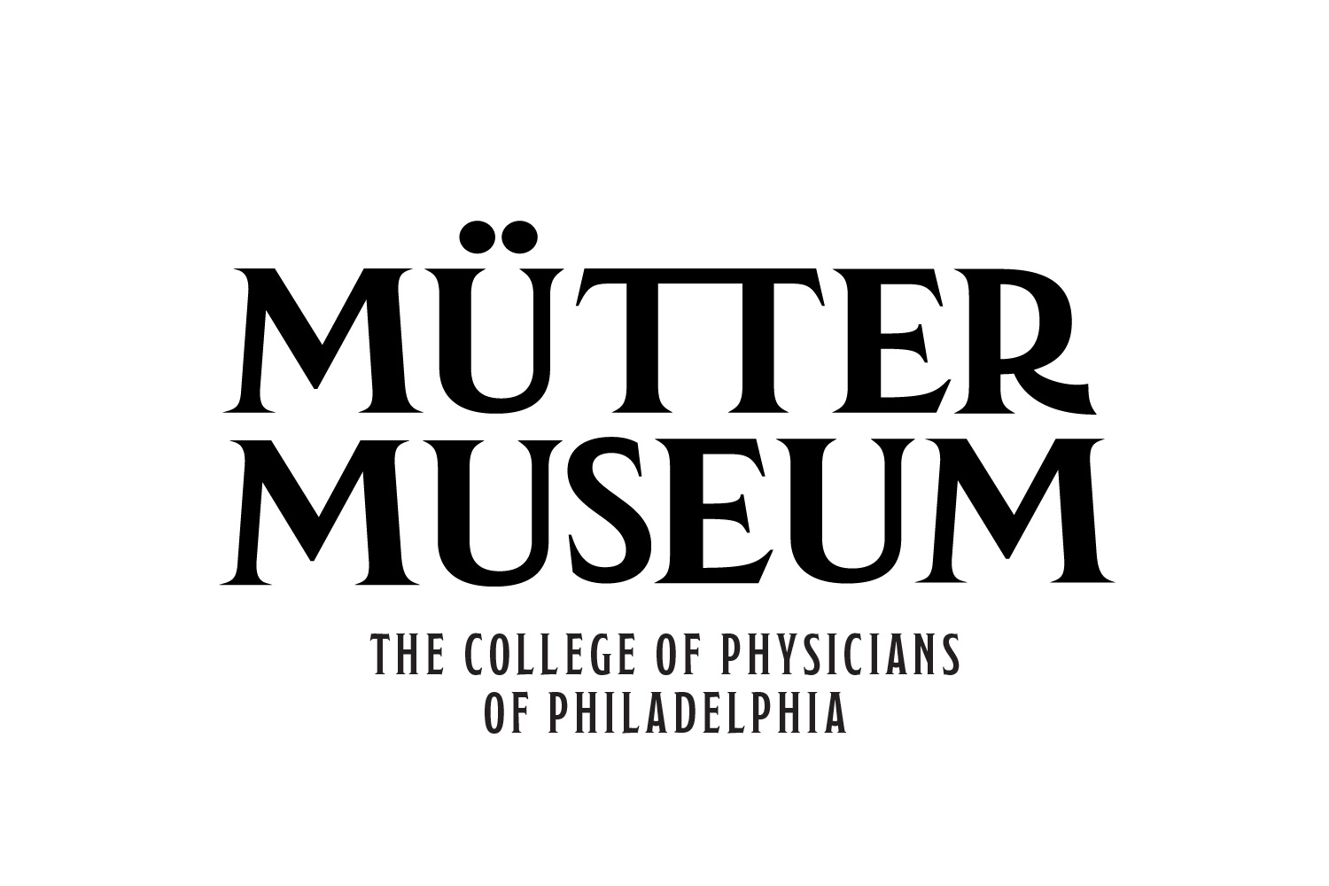
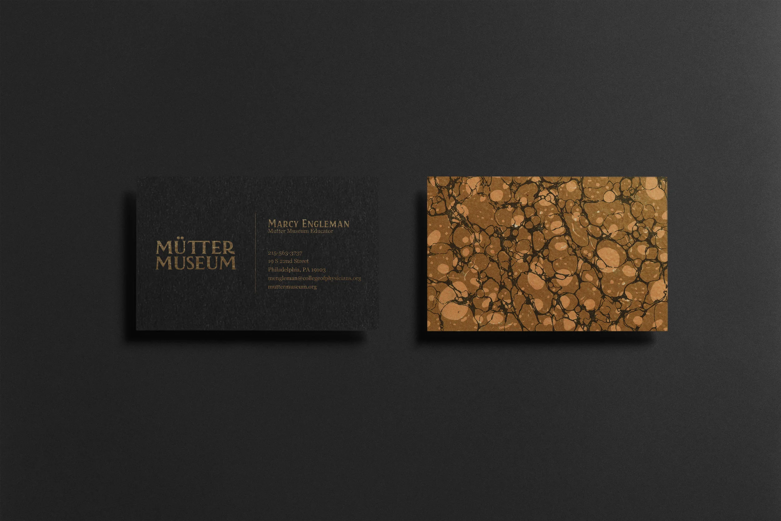
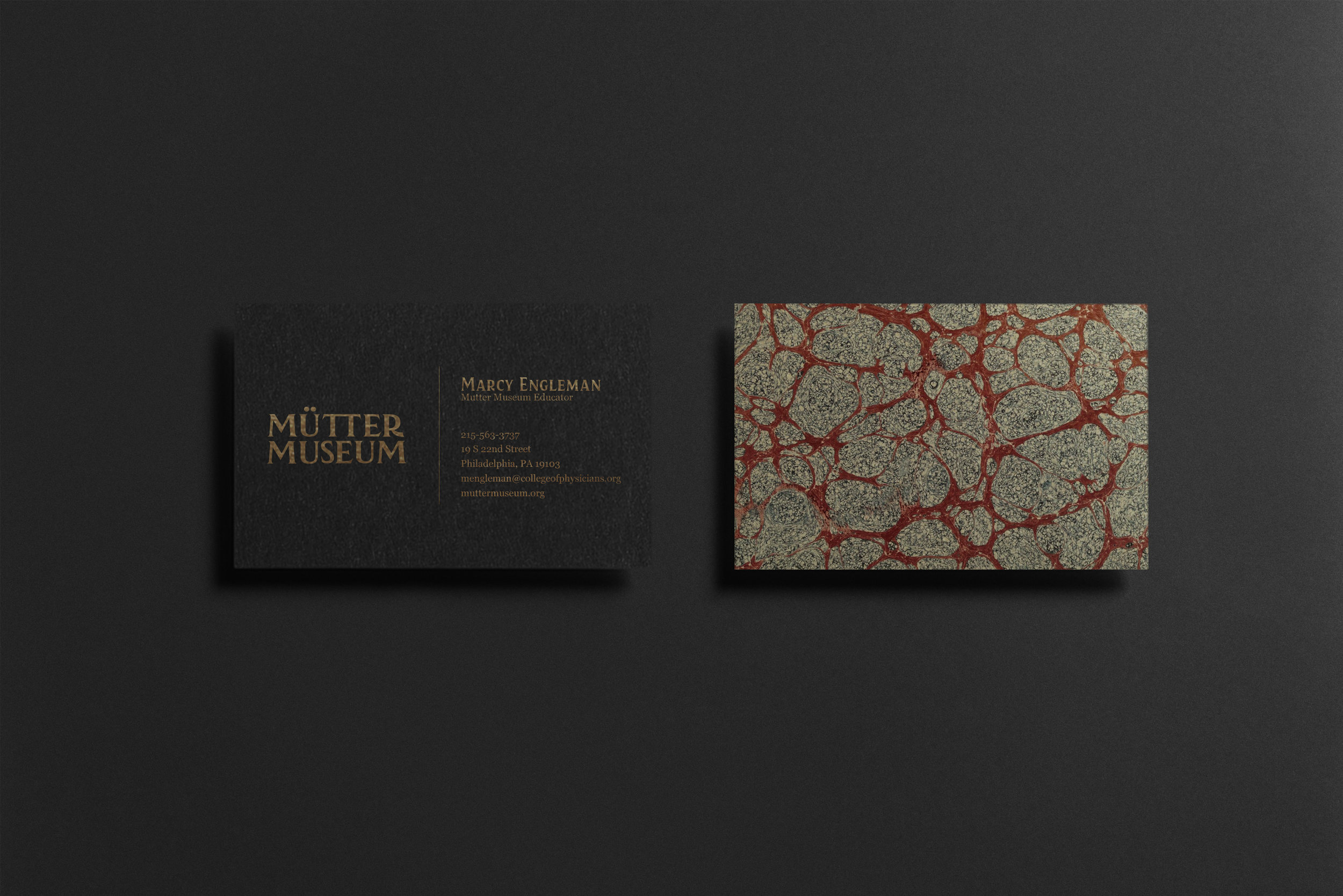
The final typeface I chose was Kertayasa. I loved the pointed serifs and the way the letterforms interact with each other. It has a very Arts and Crafts or Victorian grave marker-esque feel. The new wordmark is strong and bold but is also macabre and strange, just like the museum. I connected the bars on the “T”s as a subtle allusion to the oddities within the museum including the famous conjoined twins.

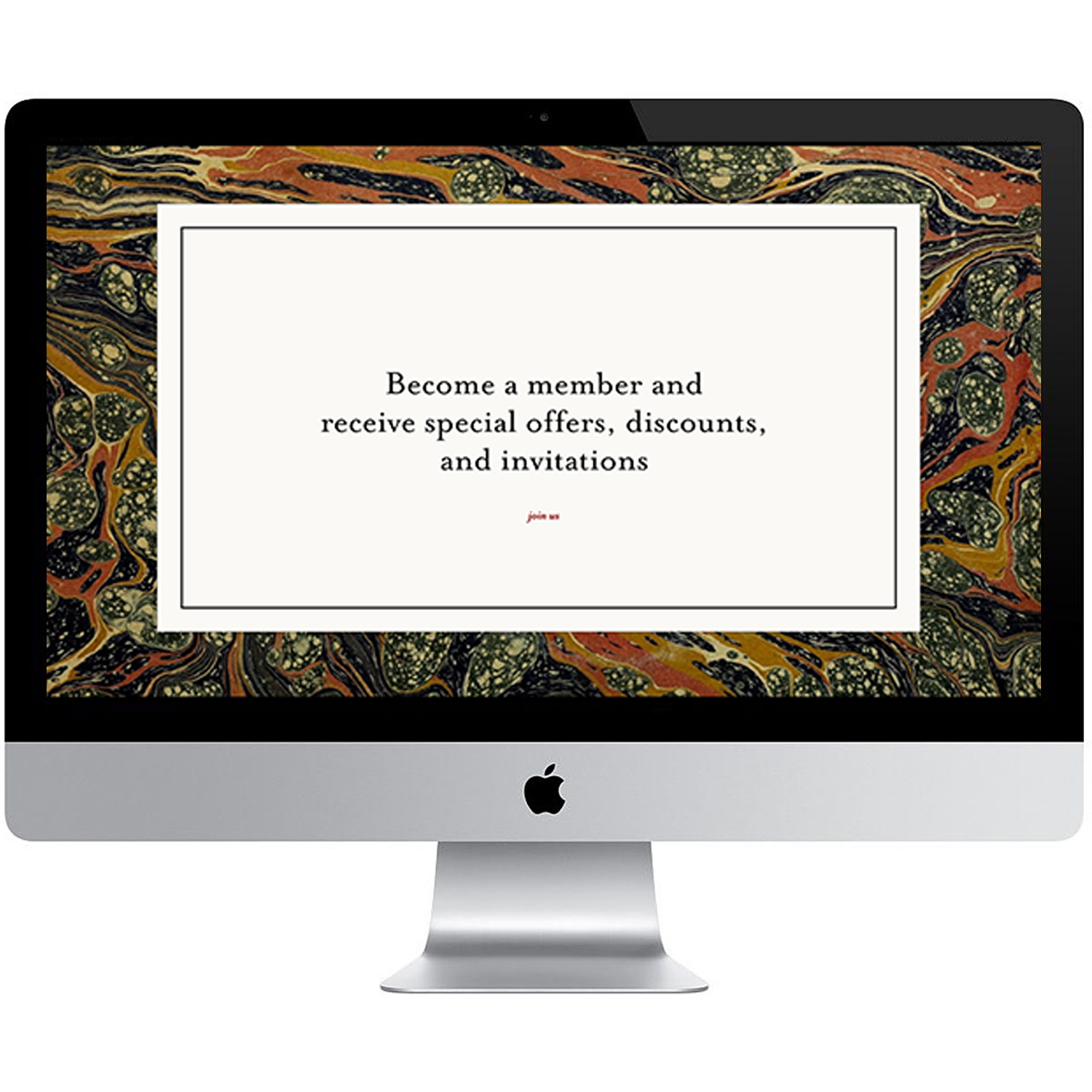
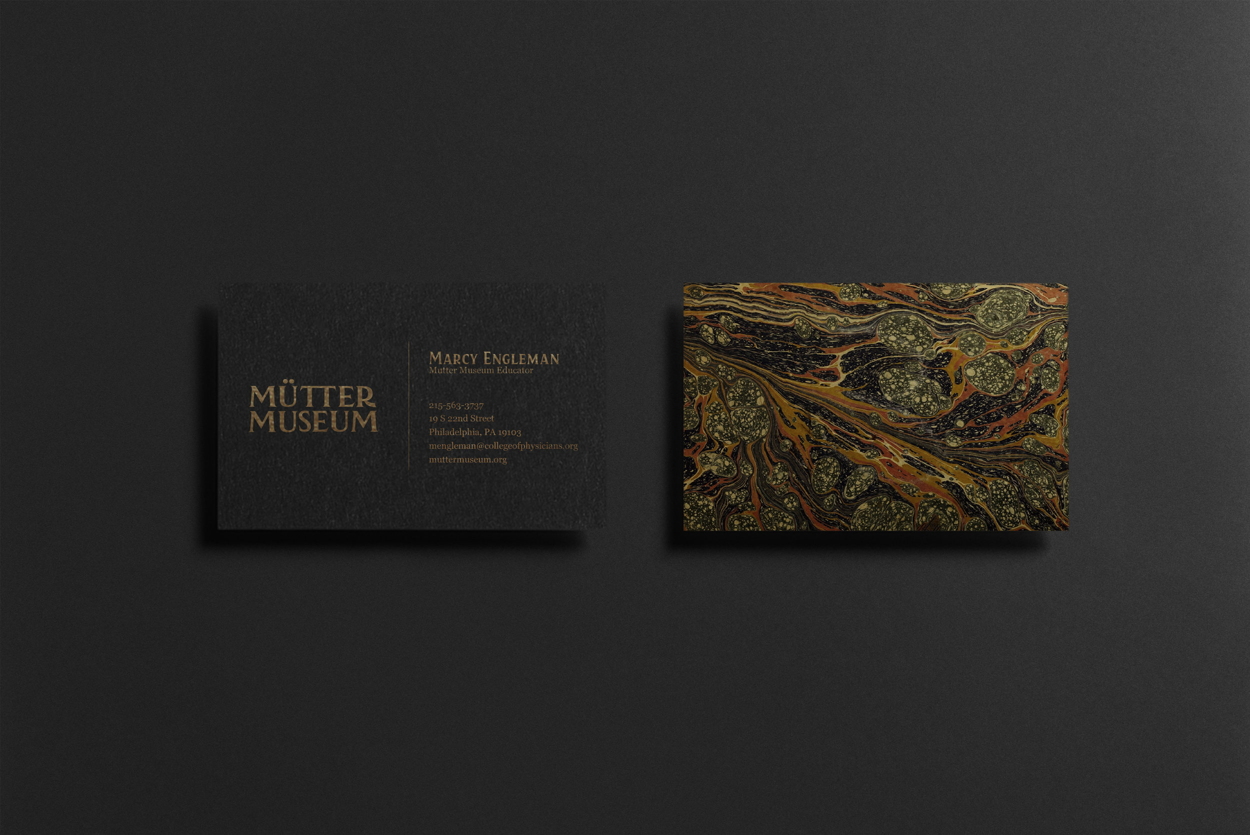
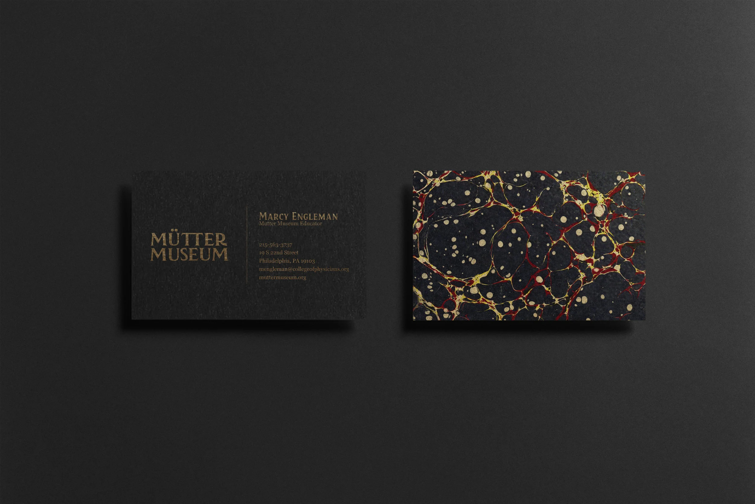
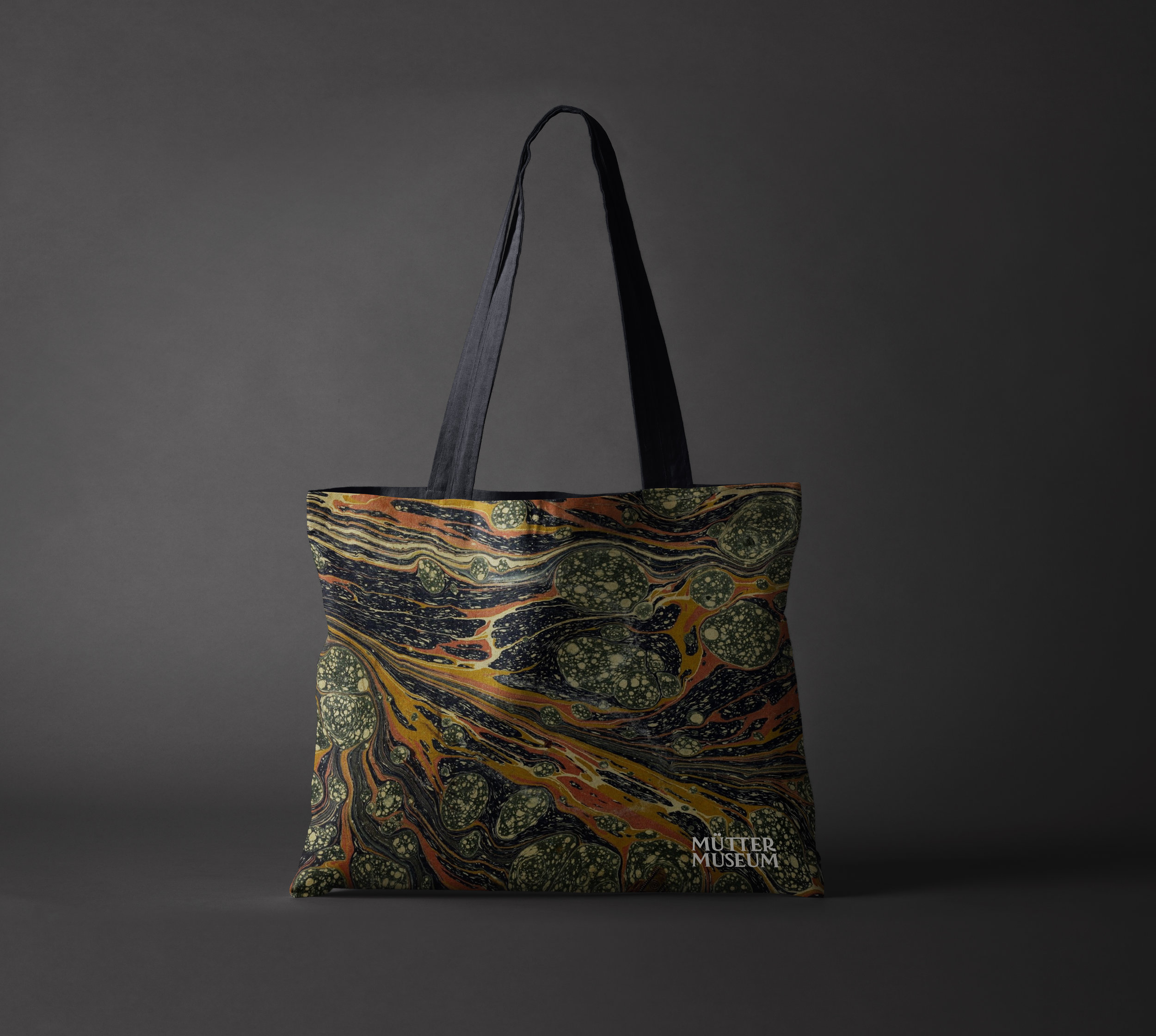
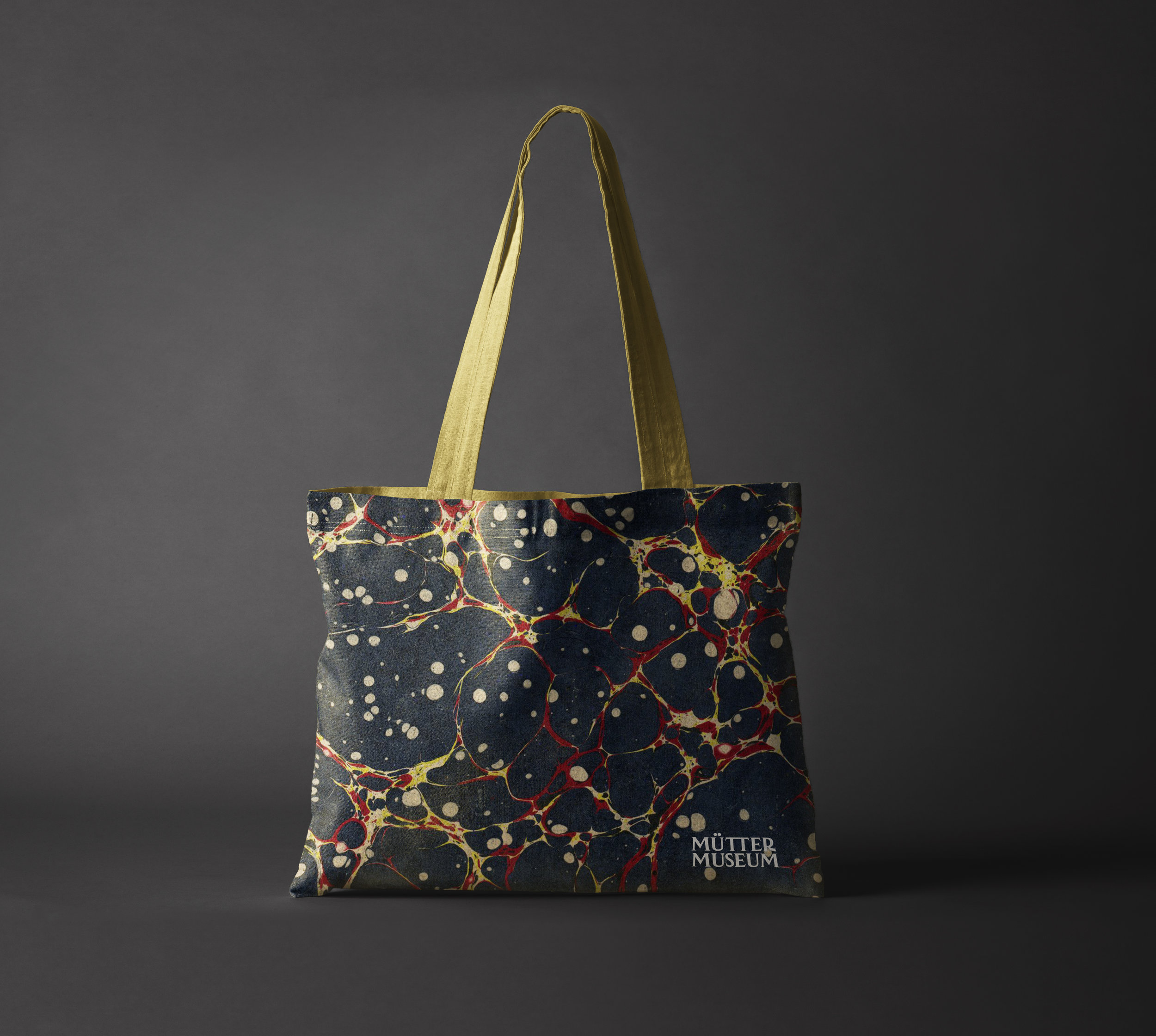
I chose Modesto Condensed as my headline typeface because it has a similar look and feel as the logo and compliments it well. For my body copy I chose Mrs Eaves because it’s irregularity and old-style characteristics fits perfectly with the brand. I then began experimenting with colors and textures for the brand. I thought about marbled paper and how beautiful and elegant it looks but also how some designs resemble the nervous system and overall visceral feeling. Marble can be found throughout the architecture of the museum as well. I chose four main marbled papers that best emit the visceral reaction I want and would be used throughout the brand.

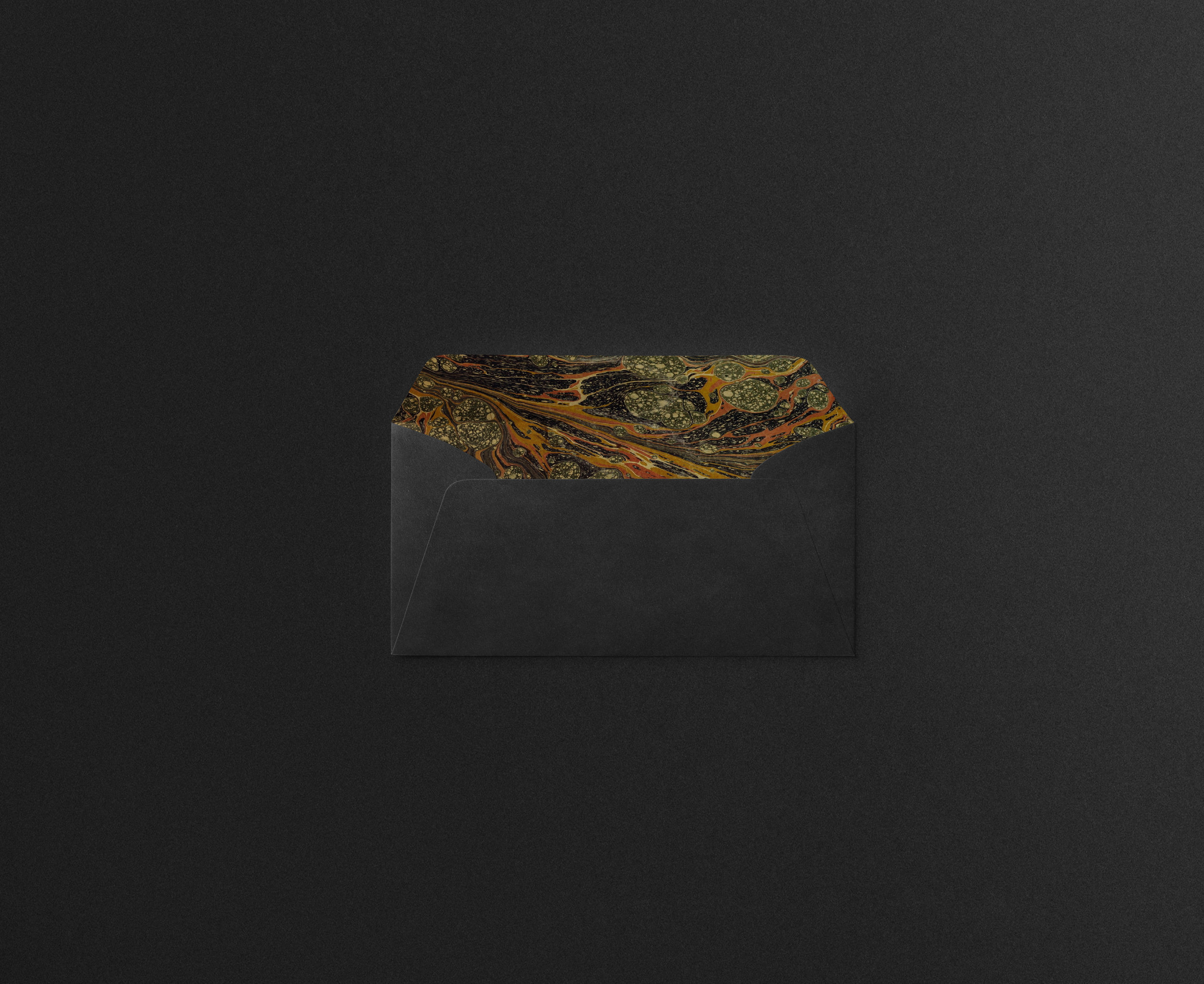
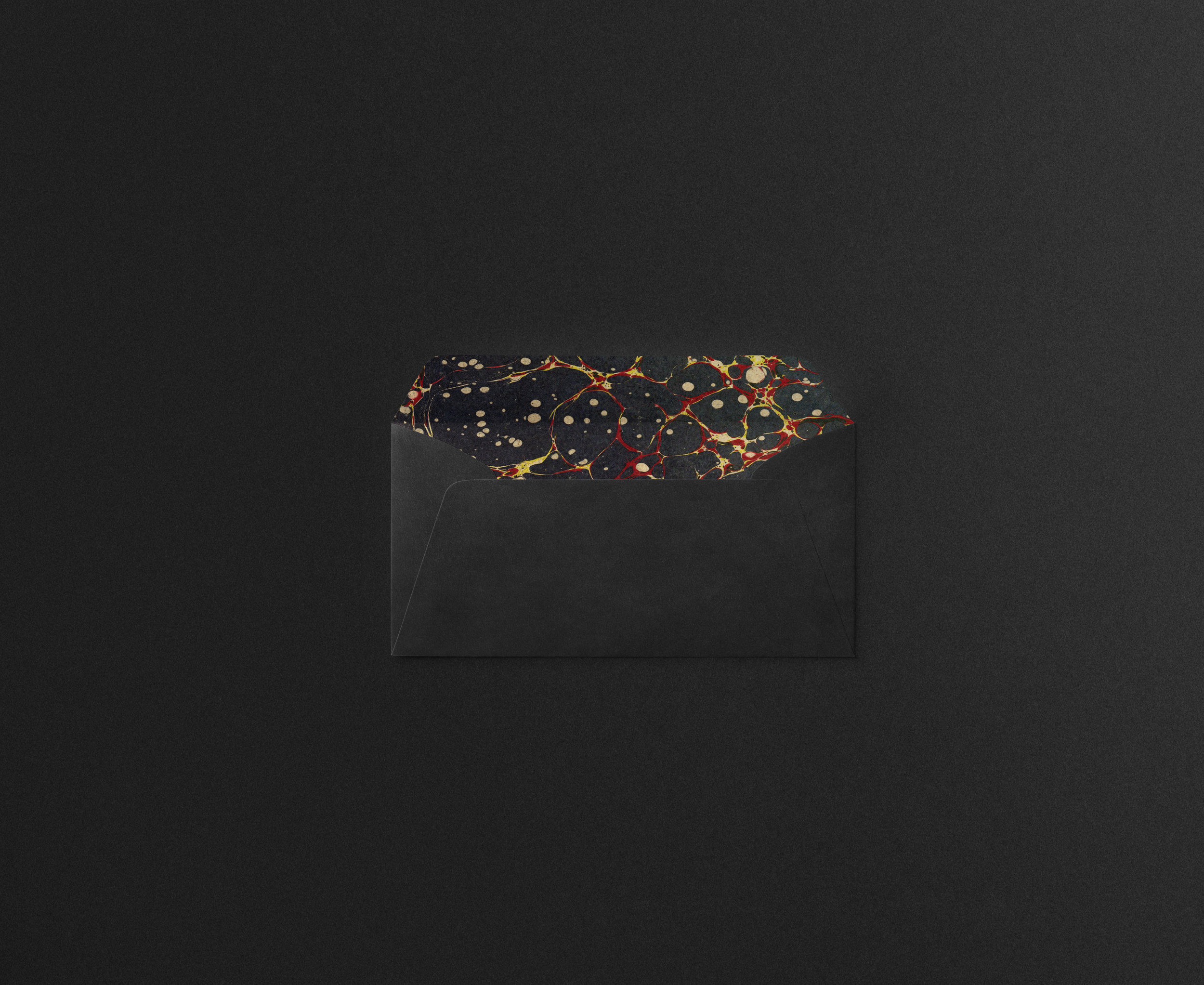
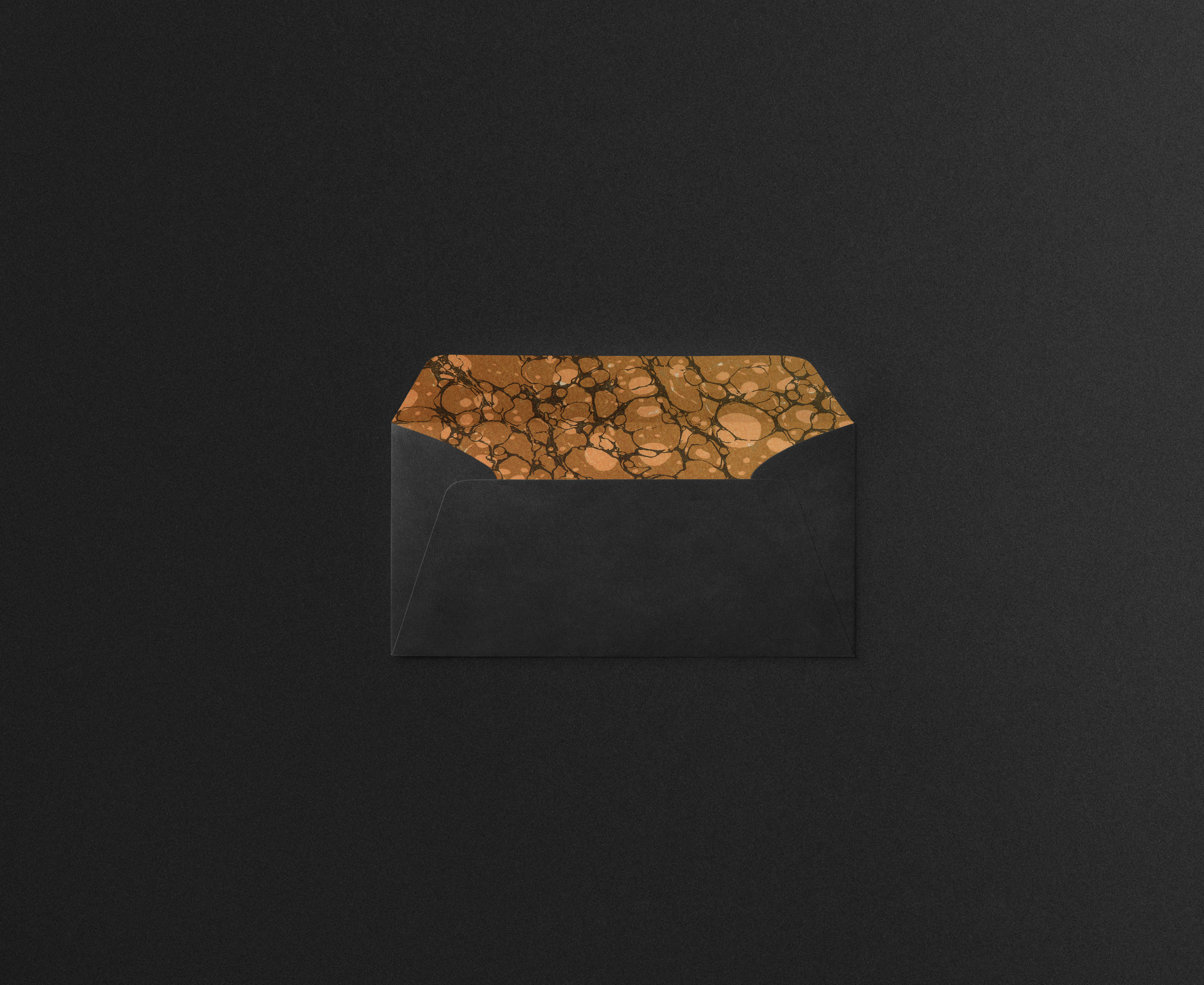
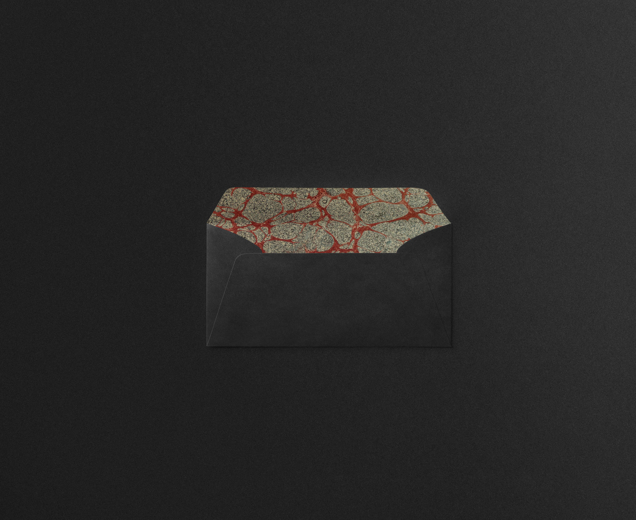
I applied my new brand to stationary. Keeping up with the dark aesthetic and foiling the logo with a luxurious and antique gold. There are four styled business cards each with the different variations of marble on the back. The museum has two envelope designs, a standard mailing envelope as well as a more lavish and exclusive black envelope with a wax sea on the back. The black envelope is for members or donors of the museum for a more unique and personal experience. The membership envelopes also have the marbled textures on the inside, an exciting surprise when opening and a nod to the overall visceral feel of the brand.


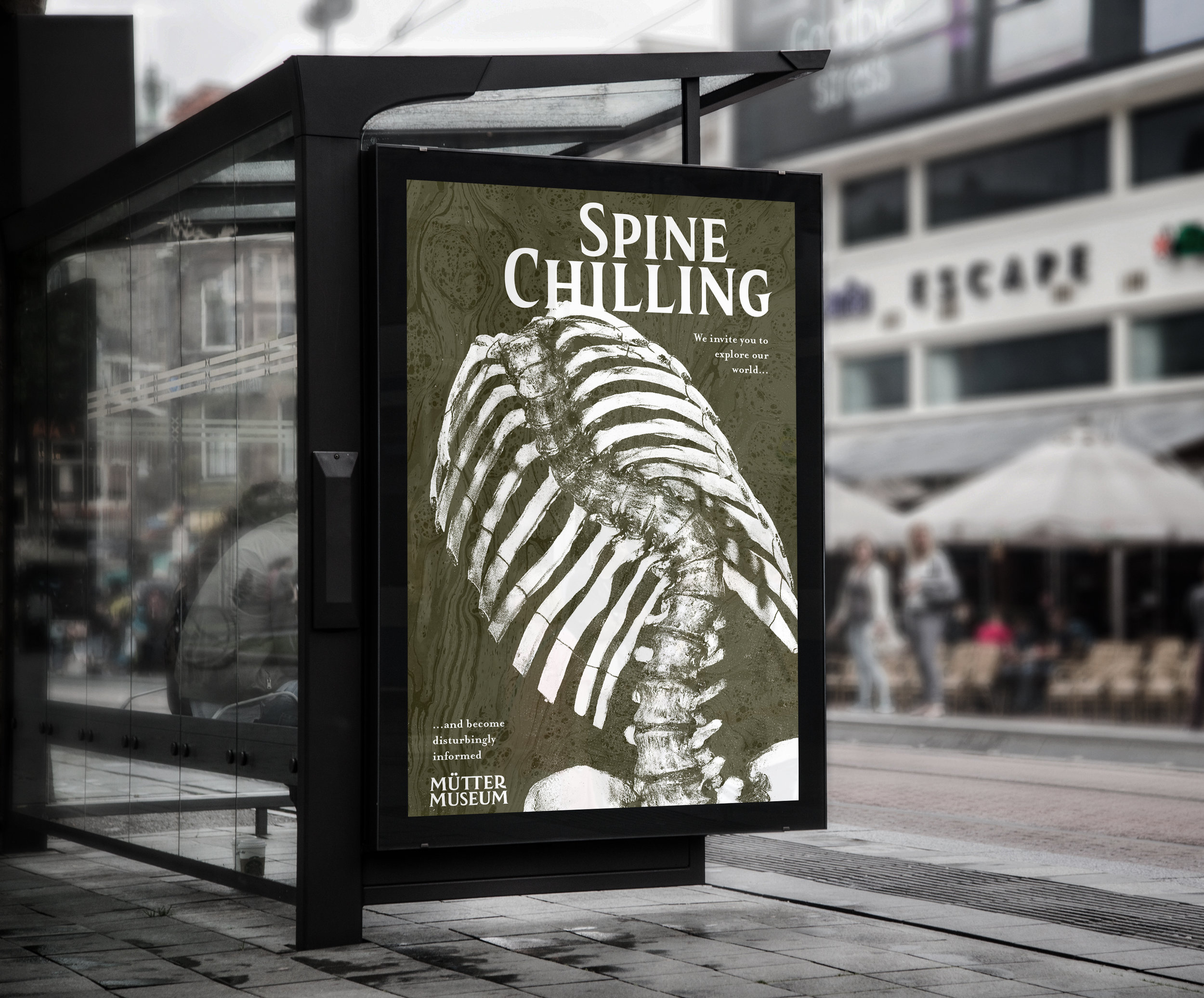
I also created new advertisements for the museum. I wanted them to feel modern, edgy and fun to attract attention and visitors. I did monotoned versions of the marble beneath striking images of oddities that can be found inside the museum. I complimented the imagery with intriguing copy that plays with the wording of the subject matter and the experience you will have at the museum. The advertisements would be scattered around the city on billboards, bus shelters, lamp posts, banners and more.


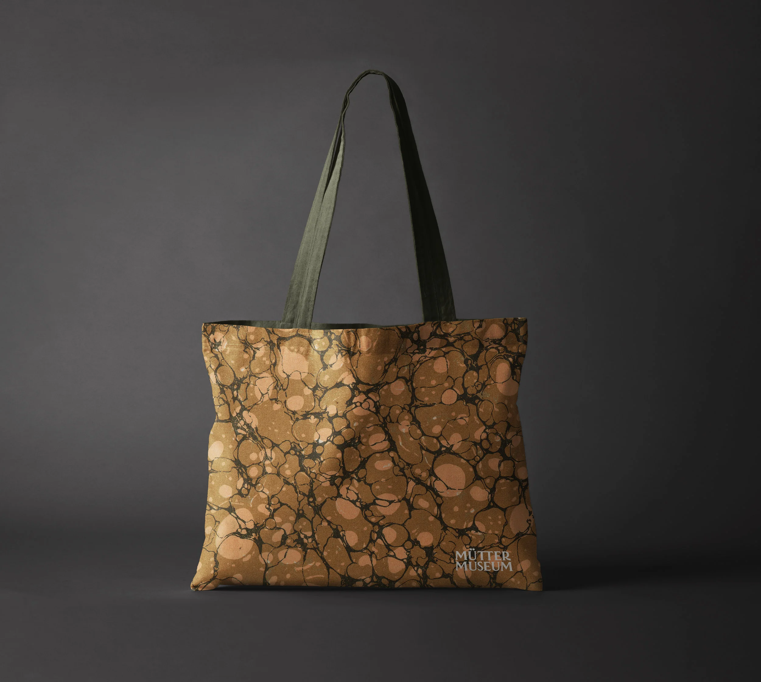
I also designed new merch to match the updated branding and identity. Totes showcasing the four elegant marbled textures, a decorous product for any museum goer. To contrast the more refined bags I designed grungy, dark t-shirts embellished with the logo on the front and the striking white spine across the back. The merch is meant to please the wide range of audience that frequent the museum.


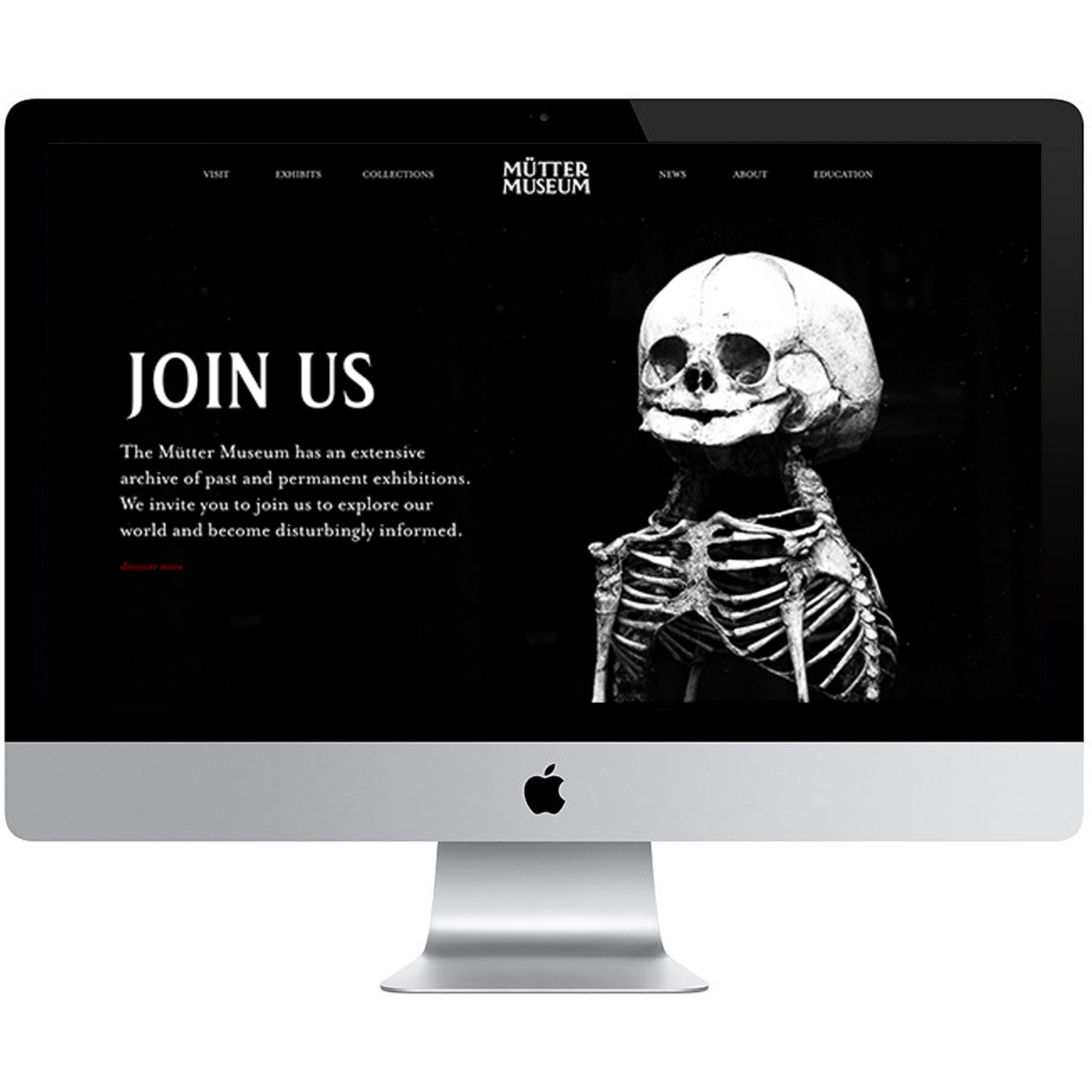
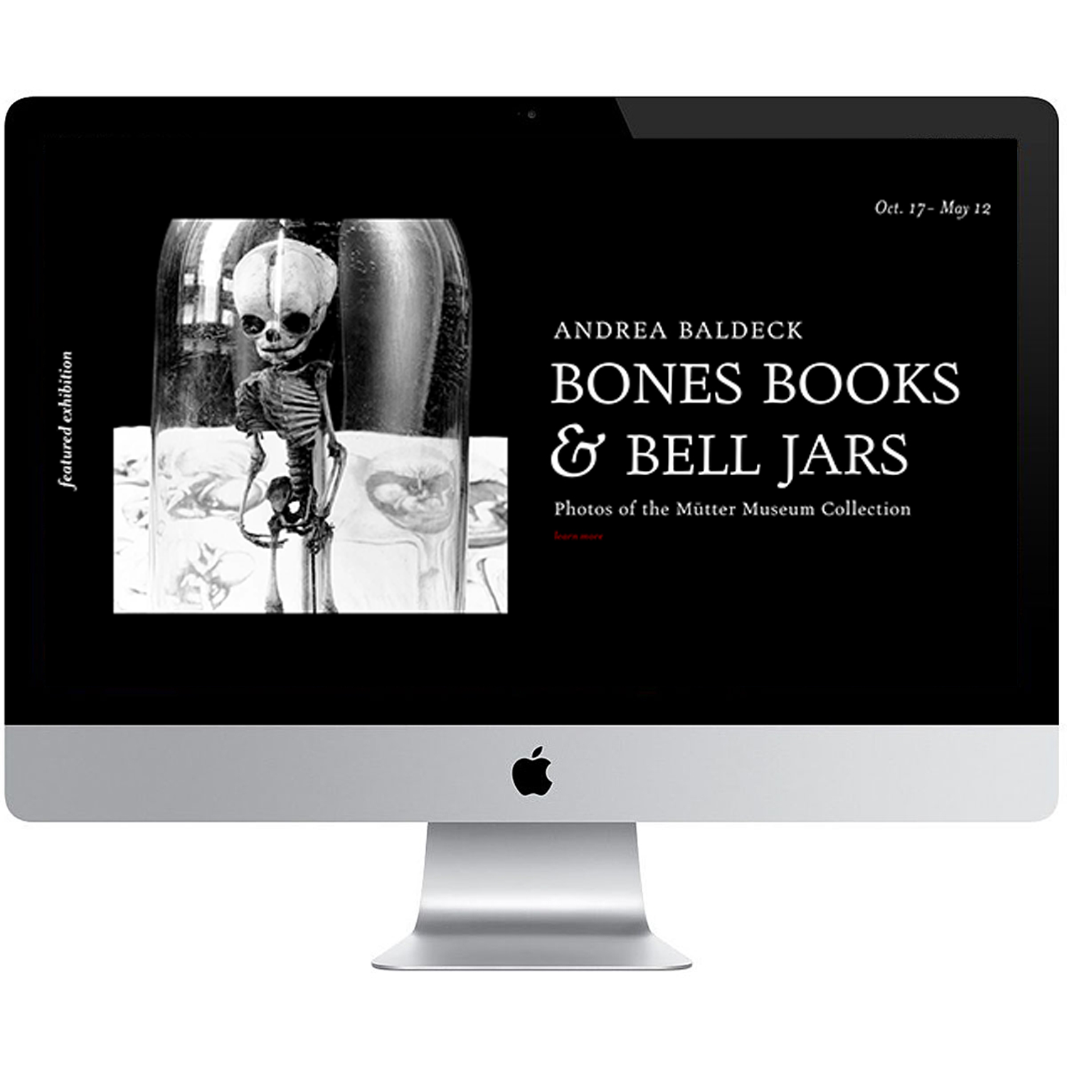
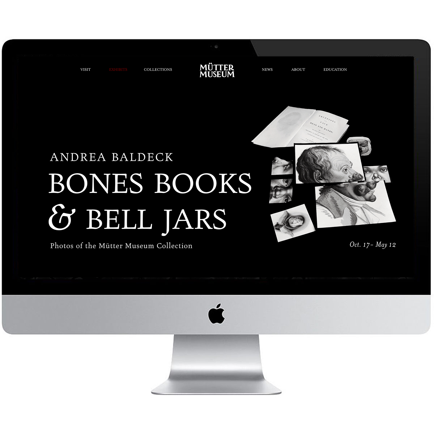
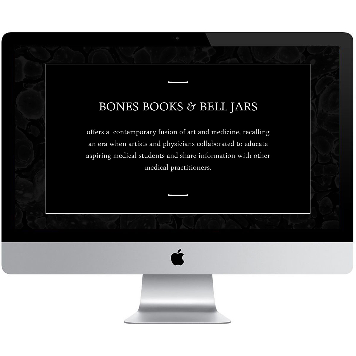
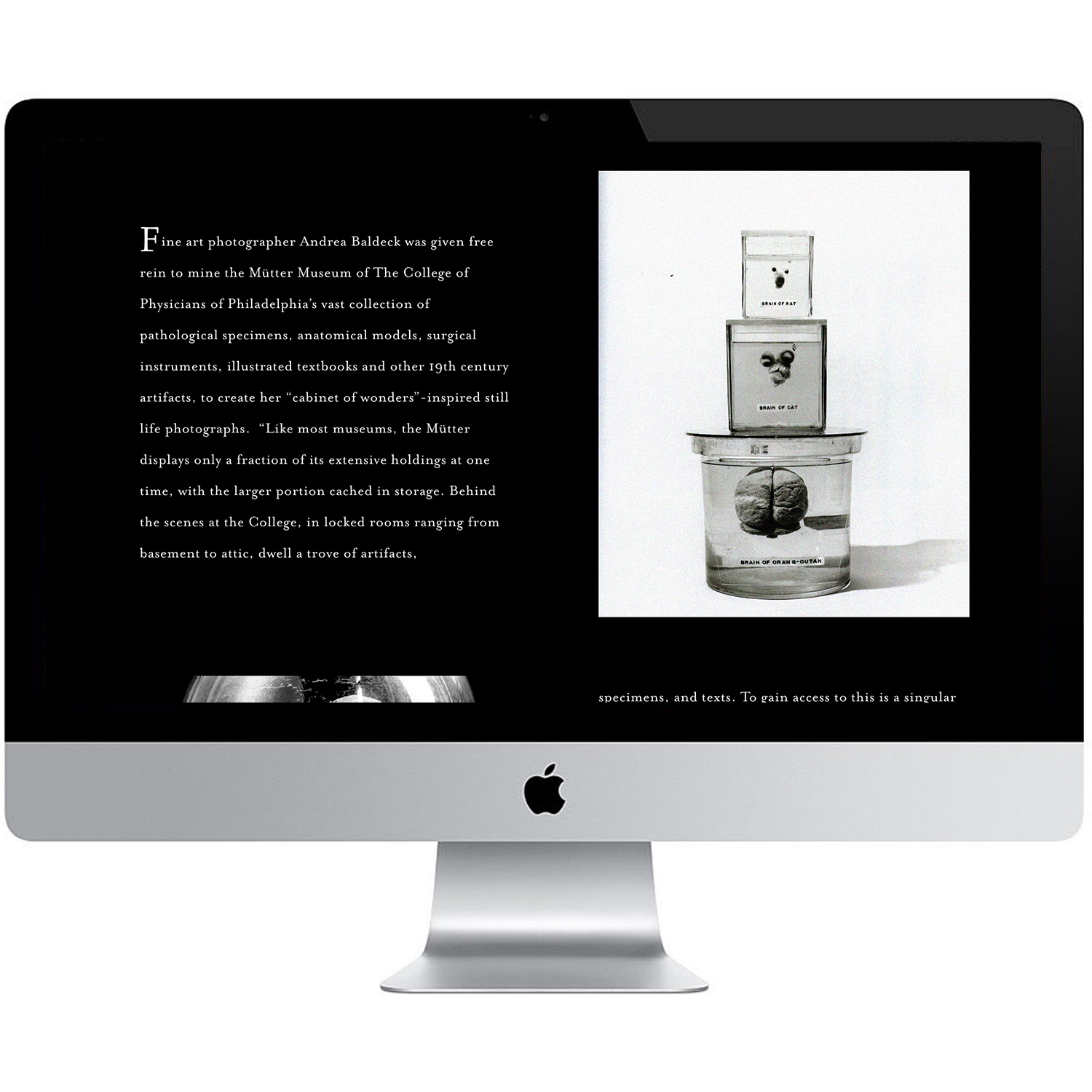
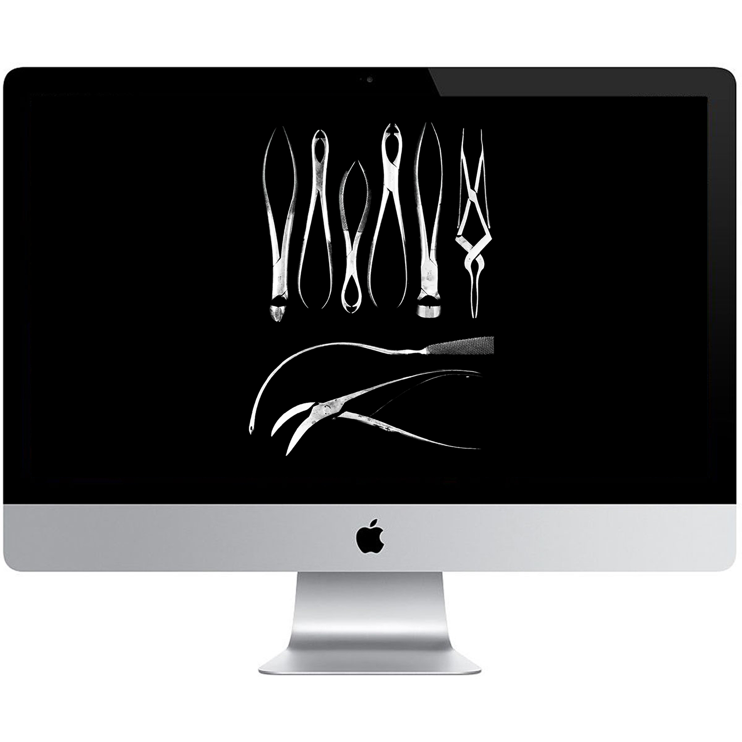
Finally, I updated the museums website to fit the new identity. I cleaned up the UI and gave the site a darker look. The site design was very print inspired, I wanted to maintain the antiquity and authenticity of the museum while still giving it a fresh modern look.